Typography is super important in visual storytelling because it really boosts the power of images. Whether you're putting together a poster, a photo book, some gallery prints, or marketing materials, mixing expressive text with great photography can turn average visuals into something truly memorable.
In this blog, we're diving into some creative ideas to convert photo to typography layout prints that can breathe life into photo-based prints, helping both newcomers and experienced creators take their work up a notch.
1. Let the Photo Lead, Then Complement with Type
When you're dealing with photo-based prints, always build your design around the image itself. Start by taking a good look at the photo:
- Spot the focal point: What grabs the viewer’s attention first?
- Check the contrast: Are there light or dark spots where text can stand out?
- Look for natural lines or textures: Can the text curve around or flow with these elements?
Once you've got a handle on the image, pick typography that boosts it without overwhelming it. Simple, minimalist type usually works well with visually rich photos, while bolder fonts can make straightforward images really stand out.
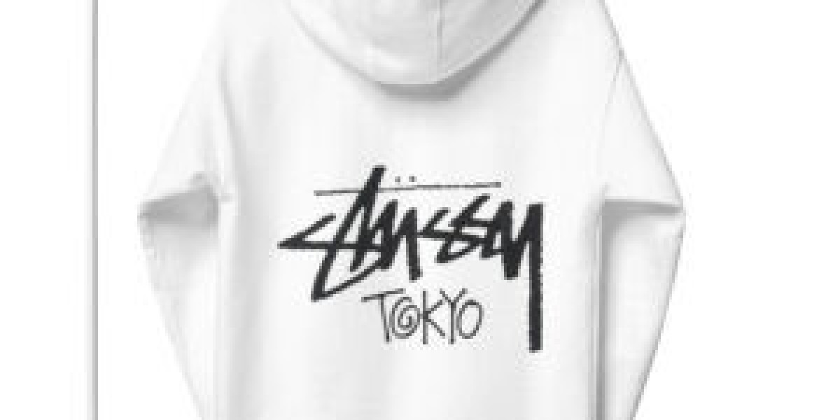
2. Embrace Text as a Design Element, Not Just a Caption
Typography doesn’t have to sit neatly below or above a photo. It can be woven into the photo itself, becoming an integral part of the design:
- Overlay text across negative space: This makes the text feel organic and harmonious.
- Wrap text around shapes or subjects: Great for portraits or lifestyle photos.
- Integrate type within architectural or scenic lines: For example, placing a title along the edge of a building or horizon.
This approach turns words into visual assets, increasing engagement and enhancing the emotional connection between image and message.
3. Play with Scale and Hierarchy
Effective typography uses size and weight to establish hierarchy, guiding readers through your content. Imagine a travel poster, where the city name is bold and large, and the tagline is smaller and refined.
- Large, bold headlines create emphasis and catch attention.
- Medium subheadings help guide visual flow.
- Smaller captions add context without distraction.
Experiment with scale to see how it affects mood. Massive typography evokes drama and confidence, while smaller type can give a delicate, elegant feel.
4. Choose Fonts That Reflect Tone and Emotion
Typography sets the tone just as much as the photo itself. Typeface selection communicates mood:
· Serif: Best for editorial prints
· Sans Serif: Suitable for modern posters
· Script: Elegant for wedding or personal lifestyle
Always ensure that the typeface supports readability. Script fonts may look beautiful over a romantic photo, but can become unreadable if too ornate.
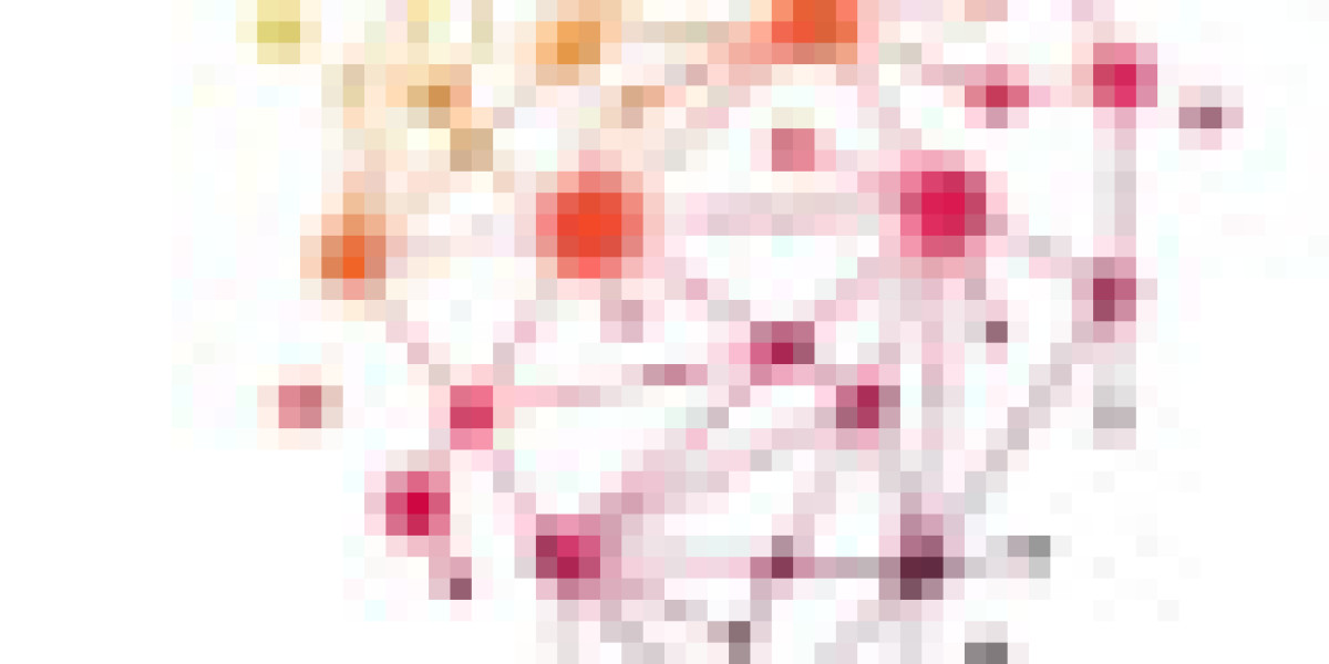
5. Use Color to Create Unity and Contrast
Color connects typography with the photo’s palette. You can either harmonize or contrast:
· Harmonize with the Photo: Pick text colors from the photo itself, from a vibrant sunset or muted shadows, to create visual unity.
· Contrast for Emphasis: Use white or black to ensure legibility and to make text stand out. Complement or accent colors work beautifully when used sparingly on key words.
Use a subtle shadow or outline to improve text readability on mixed-color backgrounds.
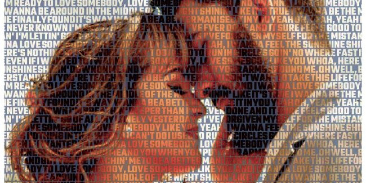
6. Blend Words and Images Creatively
Typography can really mix up text and imagery:
- Text masking: This technique lets the image peek through the words, creating a cool blend of visuals and meaning.
- Shape-based typography: You can shape your words to follow the lines or features in your photo.
- Cutouts and silhouettes: Words can take on forms, creating frames or silhouettes that enhance the design.
Using these techniques turns typography from a simple tool into a true art form.
Wrapping Up: Typography That Tells a Story
A picture made of words is especially strong because it weaves together visual narratives with carefully chosen words. Whether you’re crafting a travel poster, a photo book, social media content, or a gallery print, make sure your typography supports the story rather than overshadowing it.
The best designs are those where the text and imagery work together in style and purpose. Typography isn’t just about putting letters on a page; it’s about amplifying your photos in a way that resonates deeply and leaves a lasting impression.